Can we ever know how many jobs the Obama Administration has saved?
Almost two months ago, President Obama set a specific employment goal for his Administration:
I think my initial measure of success is creating or saving 4 million jobs.
It is clear that this “create or save” phrase is now a standard and important part of the Administration’s economic message.
Greg Mankiw quickly identified both the quantitative ambiguity and political creativity in defining the goal in this way. Now that we have a couple of months of data, I’d like to reprise Greg’s post with a concrete example of why this is a misleading metric that is vulnerable to manipulation.
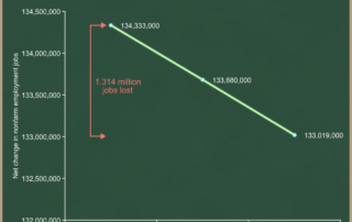
The Bureau of Labor Statistics reported the following on Friday:
| Nonfarm employment level, January 2009 | 134,333,000 |
| … plus change in February | -653,000 |
| … plus change in March | -661,000 |
| … equals nonfarm employment level, March 2009 | 133,019,000 |
| Net change in Obama Administration | -1,314,000 |
You can see that the U.S. economy has lost a net 1.314 million jobs since January. Let’s look at it graphically:

The traditional way to measure jobs “created” or “lost” is by taking the change between the starting point and the ending point of your timeframe. I have displayed this in red on the graph. Administrations are always judged (at least by the press) based on the change in the level of employment from January 20th in their first year to the current level.
I think the traditional way is a poor metric because political and business cycles don’t line up. I will expand on this further in a separate post about starting points, and whether it’s fair to assign blame or credit to the Obama Administration for jobs lost in the first two months of their Administration.(Hint: It’s not, but it is always done so they are stuck with it.) For now I want to focus on the “or saved” point. We start with the factual statement that the U.S. economy has lost a net 1.314 million jobs since the beginning of the Obama Administration.
Suppose, however, that you had anticipated the situation would be even worse. Suppose you had thought that the employment level would be down to 132.5 million in March, rather than the actual 133.0 million. I’ll draw this as a new yellow line on the same graph and label it the “counterfactual baseline.” This is what you […]