This is the first in a three part post.
- (this post)
- The Ryan budget proposes lower deficits and less debt than the Obama budget
- How will President Obama respond this year to Chairman Ryan’s lower deficits and debt?
The business of Washington, DC is changing policy. Almost everyone in Washington is trying either to change some element of policy or to prevent someone else’s changes.
As a result the public debate centers almost entirely on the fight over how and how much policy would change rather than on what the absolute results would be. Both are important, but public debate usually ignores the results and only argues about the proposed change. That’s bad.
In fiscal policy this often leads to endless debates in which both sides agree on what the result of a proposed policy would be, but disagree on whether that result is an increase or a decrease because of disagreements about the baseline, the starting point for measuring a change. It also leads to poorly informed decisions in which policymakers ignore whether the results are acceptable relative to an objective standard.
I care a lot about whether a proposal increases or reduces the deficit. I care a lot more about these changes, and about deficits in general, when the resulting deficits are 7-10 percent of GDP than when they are 1 or 2 percent.
I am therefore going to do something a bit unusual with today’s chart. I’m going to show you the deficits proposed by President Obama in his budget without telling you whether they are increases or reductions relative to some (easily disputed) future baseline. By doing this I hope to focus your attention on a different way of thinking about the deficit that may be more important than the way Washington traditionally looks at a budget. Instead we’re going to compare the President’s proposed deficits to two results standards that are difficult to gimmick.
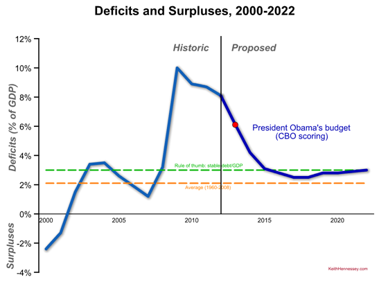
Here are deficits and surpluses since 2000 and President Obama’s proposed deficits for the next ten years. I’d like you to focus on (1) the shape of the the dark blue proposed line and (2) how it compares to the green and orange dotted lines. As always, click on the graph to see a larger version.
- This graph is measured in percent of GDP.
- Actual historic surpluses (in 2000 and 2001) and deficits are in medium blue. The President’s proposed deficits are in dark blue, to the right of the black vertical line.
- The red dot shows the most important proposed deficit, that for Fiscal Year 2013, the year Congress is now working on (in theory). This fiscal year begins October 1, 2012. The President proposes a 6.1% deficit for FY13. This year’s (FY12) deficit is projected to be 8.1% of GDP.
- The dotted orange line represents the average (pre-2008 crisis) budget deficit of 2.1% of GDP. That’s the average from 1960-2008.
- The dotted green line is at 3% of GDP, a rule-of-thumb line for the deficit/GDP that would result in debt/GDP staying constant. Deficits above the green line mean the debt is increasing relative to our economy, while deficits below the green line mean the economy is growing faster than government debt [held by the public].
I suggest you memorize three numbers when you’re discussing deficits: 0, 2, and 3.
- Zero is a balanced budget, of course.
- The historic (pre-crisis) average budget deficit is about 2% of GDP.
- A deficit of roughly 3% of GDP will hold debt/GDP stable.
(Technically the 2 is between 1.8 and 2.1, depending on exactly when you start the window. For a rule of thumb, two works great.)
Key #1 to understanding the President’s budget is that he would bring the deficit down below the green line and then make sure he doesn’t break above it again. I’d bet heavily that’s the principle his budget director used in building this budget – get me to a point where we are (just barely) not increasing debt/GDP, at least at the end of the 10-year budget window.
Key #2 is that at no point in the next ten years would his deficits be at or below their historic average. The proposed blue line is at all times above the orange line.
This is consistent with where the President has been on the deficit since his “second” budget proposal last spring. If Congress does what the President proposes, the debt/GDP situation will briefly stop getting worse for a few years at the end of the next decade before entitlement spending pressures once again start driving deficits up.
It also means that the President would not, for a single year, get deficits below their historic average. Rather than fluctuating around 2% of GDP as it has since 1960, the President proposes a new medium-term deficit ceiling of 3% of GDP.
Conclusion: The President’s budget would result in deficits that are always higher than the historic average but would, beginning six years from now, temporarily stop government debt from increasing relative to the U.S. economy.
