The fewest numbers you need to know
This morning the Bureau of Labor Statistics reported that in February the U.S. economy created 227,000 net new jobs and the unemployment rate held steady at 8.3%.
We are still 5.3 million jobs shy of peak employment in December 2007 and 864,000 shy of January 2009 when President Obama took office.
Same data, different views
Different audiences look at employment data in different ways:
- People’s lives are most affected by the level of employment: how many people are working and what is the unemployment rate? At 8.3 percent this number is still bad.
- As both a policy and political matter, Washington, DC cares about the level, but even more about the direction and rate of change: are we adding or subtracting jobs, is unemployment rising or falling, are we “headed in the right direction?” From this view today’s report offers good news, at least on the jobs created front. I assume the Administration will cite 17 months of continuous job growth. Possibly more significant is that we have had four months of job growth > 150,000/month, which is roughly what you need to keep up with population growth. The trend continues to be positive, although you should want even bigger numbers since the unemployment rate is still high.
- Markets and market commentators care even more about how the change compares with expectations before the data was released. Today’s numbers slightly exceeded expectations of about 200,000 net new jobs so the reaction from this perspective should also be positive.
Three data reminders
The unemployment rate does not include those who are discouraged and no longer seeking work. As hiring picks up you could see more of these discouraged workers starting to look for jobs. This could cause the measured unemployment rate to decline more slowly than if the number of people looking for work remained constant.
The +227K number is a net figure. It’s the difference between something like 4.2 million hires and 4 million separations last month. (We’ll know for sure when a different survey comes out soon.) Even when the net number is small or declining there is still a lot of hiring and firing going on.
Most economists measure full employment somewhere between 5 and 5.5%. I use 5.
Political impact
I imagine they are smiling in the Obama White House this morning. There are still downside risks like oil/gasoline, Israel/Iran, and ongoing European debt problems, but the underlying trend is upward and consistent, and downside risks are nothing new.
This positive trend highlights a question about the politics of the economy. Do voters make their judgment principally on the level of the economy or principally on the direction and rate of change? Republicans will stress the former: “Are you better off now than you were four years ago?” President Obama and his allies will stress the latter: “Things are getting better.” I am a bit surprised that I cannot find any political scientists who have studied which matters more to how people vote.
Even if the current positive trend were to accelerate I would anticipate economic policy to be a (the?) central focus of the election.
- The political economic debate has already started to shift to gas prices.
- If the economy looks good, debate will shift to the fiscal picture which is still miserable.
- The parties will debate whether the recovery is because of Democratic policies or in spite of them.
Everybody loves pictures
The Administration is using their standard graph to make their case.
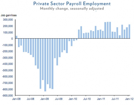
While I think they should be showing all employment rather than just private sector employment, the good news is the string of columns above the 0 axis. As expected, this graph focuses on the direction and rate of change of employment, the view the Obama White House wants to emphasize:
- the direction is positive when the columns are above the 0 axis;
- the height of the columns represents the rate of change – higher above the 0 axis is better;
- when the columns exceed about 150K the rate of change is big enough to keep up with population growth.
It is also important to understand what is going on with the level of employment as shown in the following graph. I think this graph better shows both the good news on the trend (upward slope since Jan 10) and the bad news on the level (yellow and blue arrows).

Finally, the unemployment rate graph tells a similar story. Unemployment is still quite high but is declining.
