Team Obama says the President’s budget would reduce the deficit. CBO says the President’s budget would increase the deficit. What the heck is going on? Who is right?
Let’s use Budget Bubble Graphs to see if we can understand what’s going on.
We begin by reminding ourselves that federal spending, taxes, and budget deficits have remained surprisingly stable over time. Over the past fifty years the federal government has, on average:
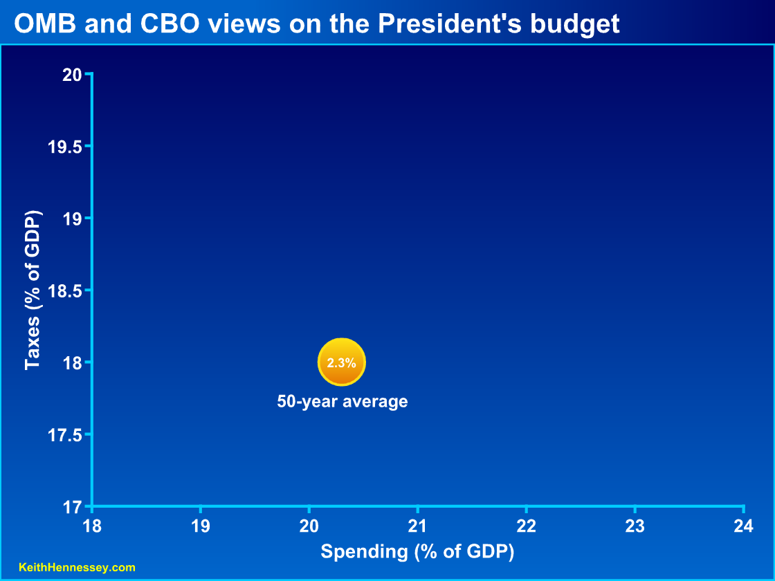
- taken 18.0% of GDP in taxes;
- spent 20.3% of GDP; and
- run a deficit of 2.3% of GDP.
While there are annual fluctuations and short-term trends, these long-term averages are incredibly stable. I believe they represent a sort of implicit political consensus about the appropriate role of government in American society, or at least a roughly stable political balancing point.
One lonely bubble
Here is that 50-year average on a simple Budget Bubble Graph. As always, you can click on any graph to see a larger version.
As a reminder, the 20.3% of spending is plotted on the x-axis. This 20.3% of spending must be apportioned between current taxes and deficits (= future taxes). On average, we have collected 18.0% in current taxes, which we graph on the y-axis. The 2.3% average annual budget deficit over the past fifty years is represented by the size of the bubble. That size won’t mean much until we have another bubble for comparison.
OMB and CBO agree on the results of the President’s budget
Let’s look at what the President’s Budget would do in 2015. I choose this date for several reasons:
- It’s far enough into the future that the after effects of the financial crisis and the recession are assumed to have worn off, so we’re looking just at desired policy in an assumed healthy economy.
- The President has chosen 2015 as a target date for his fiscal commission’s short-term goal.
- Five years out is a nice round number.
I hope you’ll trust that I am not cherry picking a year to make the numbers look bad. You can find all the data I have used here, here, and here.
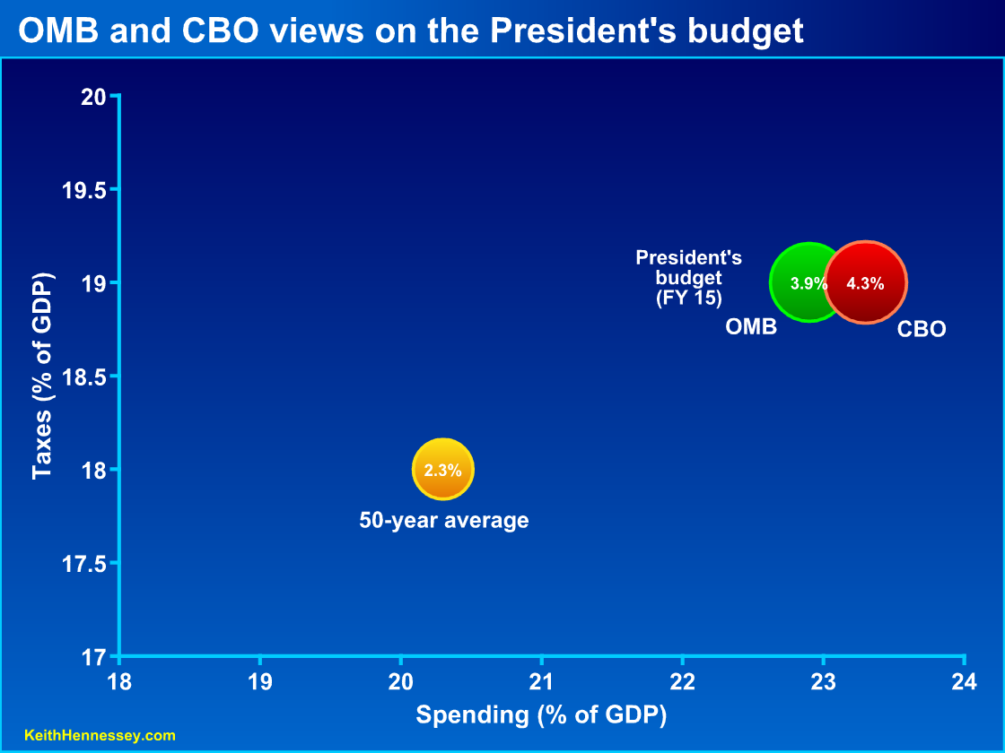
Let’s add two more bubbles. Each represents scoring of the President’s proposed policies for 2015. The green bubble shows OMB scoring, the red bubble shows CBO scoring.
Three things should jump out at you:
- The red and green bubbles are nearly identical in size and location.
- They are both bigger than the yellow bubble.
- They are both right and above the yellow bubble.
The first observation (nearly overlapping red and green bubbles) shows us that OMB and CBO have nearly identical estimates of the spending, taxes, and deficits that would result from the President’s proposed policies:
- In 2015, the federal government would spend about 23% of GDP.
- That same year the government would collect 19% of GDP in taxes.
- We would run a budget deficit near 4% of GDP.
The second observation (red and green bubbles are bigger than yellow) shows us that OMB and CBO agree that the President’s budget would, in 2015, result in budget deficits significantly larger than the 50-year historic average deficit. As a reminder, if the deficit is greater than 3% of GDP, the debt-to-GDP ratio will increase.
The third observation (red and green are right and above yellow) shows us that OMB and CBO agree the President’s budget would, in 2015, result in significantly higher spending and higher taxes than the 50-year historic average.
OMB and CBO agree that the President’s budget would in 2015 result in much more government spending, much higher taxes, and a much bigger budget deficit than America has generally experienced over the past 50 years.
OMB and CBO disagree on the starting point from which changes are measured
While OMB and CBO end up at nearly identical ending points, they begin their measurement from different starting points.
CBO measures changes from a starting point of current law. Under current law the Bush tax cuts expire at the end of this year, the Alternative Minimum Tax is not patched, and Medicare per-service payments to doctors get cut this year and each following year.
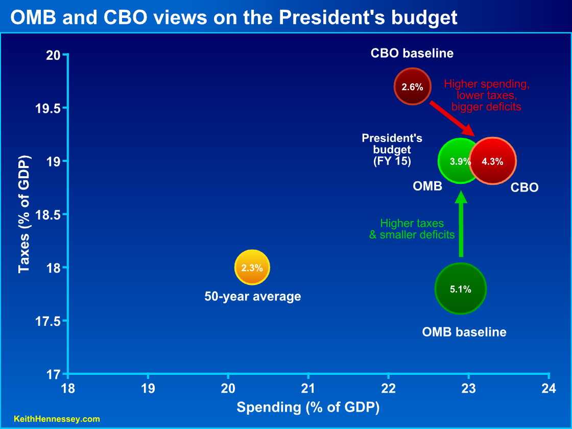
OMB creates a “current policy” baseline as their starting point. They begin with current law but assume policy changes like permanent tax relief and a permanent change to Medicare payments to doctors. The OMB current policy baseline therefore assumes higher spending, lower taxes, and bigger deficits than the CBO baseline, which is why the OMB baseline bubble is below, right, and much bigger than the CBO baseline bubble.
OMB argues their baseline represents a more reasonable starting point from which to measure fiscal policy changes. Critics argue OMB is gaming the baseline to make their proposed policy changes look better.
CBO says the President’s budget moves fiscal policy from the dark red baseline bubble to the light red CBO score of the President’s budget. Using CBO scoring, we see that, relative to a current law starting point, the President’s budget increases spending (moves right), cuts taxes (moves down), and increases the budget deficit (bigger light red bubble).
OMB says the President’s budget moves fiscal policy from the dark green baseline bubble to the light green OMB scoring of the President’s budget. Using OMB scoring, we see that, relative to OMB’s definition of current policy, the President’s budget leaves spending constant (no horizontal movement), raises taxes (moves up), and reduces the budget deficit (smaller light green bubble).
Each characterization can therefore be defended, if you accept the two different starting points. And since very few people understand or care about the difference between a current law baseline and a current policy baseline, most people are just confused.
You can see how the common press focus on just the budget deficit would give an incomplete picture of reality. The bigger bubbles are an important and scary part of the story, but if you ignore the three percentage point increase in spending and the one percentage point increase in taxes, you’re missing the rest.
You can also see why a debate about the proposed change in the budget deficit would be confusing and apparently contradictory. Is a roughly 4% deficit in 2015 a reduction or an increase from what would otherwise be the case? It depends on your starting point.
My view
I question certain assumptions in the OMB current policy baseline but will set those concerns aside for now. Two advantages of the CBO baseline are that it has a stable definition over time and it is well understood by budget wonks.
Mostly I don’t care about these philosophical baseline debates or the political rhetoric that flows from them. The debate over the starting point and the direction of the policy change arrow matters less to me than where the resulting policy bubble ends up and how big it is. I care far less about how we label the proposed changes than I do about the proposed result.
There is no significant disagreement between OMB and CBO about the proposed result: the President’s budget would result in much higher spending, taxes, and budget deficits than America is used to.
I believe fiscal policy needs to pull the red and green circles left and down toward the yellow bubble. I don’t want bigger government. I’d like to move even farther left and down than the yellow bubble, but with this Administration I’d be quite happy to stick with the historic average.
Some of the movement rightward by 2015 is built into current law, a result of the three big entitlement spending programs pushing us ever farther right over time. You can see that because the CBO current law baseline bubble for 2015 is two percentage points right of the historic average. We need to change current law to prevent government from exploding in size. We’ll examine this in more detail in a future post.
I also believe that much of the negative political reaction we have seen from American citizens over the past two years is a gut reaction to the bubbles moving right and up and growing bigger. It is not just a reaction to bigger budget deficits. It is also an adverse reaction to bigger government, measured by more government spending, higher taxes, and bigger deficits.


