Here’s Vice President Biden yesterday on This Week with George Stephanopolous:
STEPHANOPOULOS: While we’ve been here, some pretty grim job numbers back at home — 9.5 percent unemployment in June, the worst numbers in 26 years.
How do you explain that? Because when the president and you all were selling the stimulus package, you predicted at the beginning that, to get this package in place, unemployment will peak at about 8 percent. So, either you misread the economy, or the stimulus package is too slow and to small.
BIDEN: The truth is, we and everyone else misread the economy. The figures we worked off of in January were the consensus figures and most of the blue chip indexes out there.
Everyone thought at that stage — everyone — the bulk of…
STEPHANOPOULOS: CBO would say a little bit higher.
BIDEN: A little bit, but they’re all in the same range. No one was talking about that we would be moving towards — we’re worried about 10.5 percent, it will be 9.5 percent at this point.
STEPHANOPOULOS: But we’re looking at 10 now, aren’t we?
BIDEN: No. Well, look, we’re much too high. We’re at 9 — what, 9.5 right now?
STEPHANOPOULOS: 9.5.
BIDEN: And so the truth is, there was a misreading of just how bad an economy we inherited. Now, that doesn’t — I’m not — it’s now our responsibility. So the second question becomes, did the economic package we put in place, including the Recovery Act, is it the right package given the circumstances we’re in? And we believe it is the right package given the circumstances we’re in.
We misread how bad the economy was, but we are now only about 120 days into the recovery package. The truth of the matter was, no one anticipated, no one expected that that recovery package would in fact be in a position at this point of having to distribute the bulk of money.
The Vice President says that “we and everyone else misread the economy,” and that “no one anticipated, no one expected that that recovery package would in fact be in a position at this point of having to distribute the bulk of money.”
This is inaccurate. On January 10, 2009, Dr. Christina Romer and Dr. Jared Bernstein published a paper titled The Job Impact of the American Recovery and Reinvestment Plan. Dr. Romer is now Chair of the President’s Council of Economic Advisers, and Dr. Bernstein is now the Vice President’s chief economic advisor. This is the paper that was used as the basis for the President’s and Vice President’s arguments for the stimulus. Here is footnote 1 from that paper (it’s in the endnotes on page 14):
1) Forecasts of the unemployment rate without the recovery plan vary substantially. Some private forecasters anticipate unemployment rates as high as 11% in the absence of action.
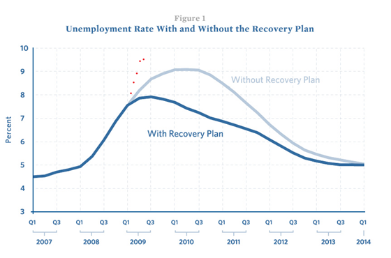
This graph from the Administration’s paper illustrates how much worse things are than was predicted. The blue lines show the unemployment rate predictions from the Romer-Bernstein paper, while the red dots are the actuals since the President took office:
 You can see that the unemployment rate is significantly higher now than the Administration projected it would be without a stimulus.
The Vice President is, in effect, arguing that we now know that the light blue “without stimulus” line was much higher than they had originally thought, and that the red dots of actual employment represent an improvement from that correct “without stimulus” line. If he thinks the stimulus is now having a measurable effect (I don’t), then he is arguing that the light blue line should be above the red dots.
I agree with the Vice President that they misestimated where the light blue line would be. In addition, I think the stimulus is having no measurable effect on the U.S. economy right now. The stimulus law was pooly designed so that the bulk of the economic effect does not occur until 2010.
In terms of the graph, I think the Administration overestimated the gap between the light blue and dark blue lines throughout 2009. I think the dark blue line should pretty much match the light blue line (wherever that light blue line might be) up until the fourth quarter of this year.
I think the Vice President would say that, were they recreating this graph today with new information, they would put the light blue line above the red dots, and the dark blue line would match the red dots. In contrast, I would argue that both the light and dark blue lines match the red dots, and will continue to do so for several more months. Beginning in the fourth quarter of this year, the stimulus will start to have a significant effect, and the dark blue line will drop below the light blue line. Of course, since we have no way of knowing where the real light blue line would be, it’s impossible to prove.
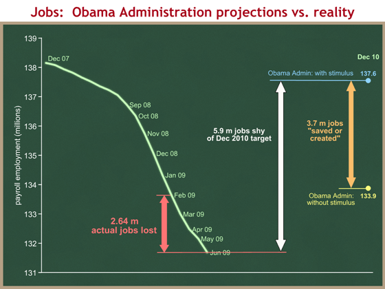
The above graph shows the unemployment rate: what share of the population is actively looking for work and not finding it. I have made a similar graph that compares the Administration’s January 10 projection of employment levels with reality, how many people are actually working. Since Dr. Romer and Dr. Bernstein did not create a graph like the one they did for the unemployment rate, we can only compare reality now against what they projected for the end of 2010, but it is still useful to see the gaps.
(Sources: BLS for actuals and here, Romer/Bernstein paper for projections)
There’s a lot here, so I will walk you through it step by step. The green line shows how many millions of people are employed in the United States, based on the payroll survey. When you heard last Thursday that the U.S. economy lost 467,000 jobs in June, that’s the drop on this graph from May 09 to June 09.
I have started counting actuals for President Obama with the February 09 jobs report, which came out on March 6. The red arrows show that a net 2.64 million jobs have been lost in the U.S. economy since President Obama took office. I’m being slightly generous in that jobs lost in the President’s first 10 days in office are not counted in this total. Also, I’m starting the graph at the all-time peak of employment in December 2007, when NBER designated the beginning of the recession. Had I begun this graph in January of 2009, the visuals would have looked worse, but I think this is a fairer presentation.
On the right we have the Administration’s projections from the January 10 Romer/Bernstein paper (Table 1 on page 5). They projected that if the stimulus were not enacted, there would be 133.9 million people employed in the fourth quarter of 2010 (the yellow dot). They projected their proposal would “save or create” 3.7 million jobs by that time (the orange arrow), and they projected a post-stimulus employment level in the fourth quarter of 2010 of 137.6 million people (the blue dot). In both cases I’m assigning December 2010 to “Q4 2010.” In doing so I’m giving the Obama team until the end of the quarter to allow a little more time for job growth.
For the Administration’s original projection to be correct, the U.S. economy will have to create a net 5.9 million jobs between now and December 2010.
This graph demonstrates why the “created or saved” metric is so dangerous. It’s the delta between two projected figures. Projecting both ends of the orange arrow allows the person doing the estimate to have a tremendous amount of control over the size of the arrow, and thus over the projected number of jobs “saved or created.” This is why some people have criticized the Administration’s use of this measure.
Yesterday the Vice President implicitly argued that the Administration’s mistake in January was not in estimating the size of the orange arrow, but the level of the yellow dot, the forecast for where the economy would be without a stimulus.
The President and Vice President routinely claimed that the stimulus would “create or save” 3.5 million jobs. The above graph shows that is a projection of the change in the level of employment for the fourth quarter of 2010. I have never heard them say that the same paper projected that the stimulus would “create or save” 2.2 million jobs by the fourth quarter of 2009. While this number is easily calculated from the Romer/Bernstein paper, the Administration apparently chose not to emphasize it in the President’s and Vice President’s remarks.
For those interested in replicating this calculation, I calculated this by multiplying the “2009 Q4” column of Table 3 by the “Total Effect” column in Table 2, and then summing the totals.
Tip for reporters: Ask the Administration if, given their misreading of the economy, they still hold to their January projection of 3.7 million jobs “saved or created” by the fourth quarter of 2010. I expect they will say yes, their estimate of the effects of the stimulus has not changed, only their estimate of the baseline from which those effects are calculated. If they do, ask if they still hold to the projection in that same report of 2.2 million jobs “saved or created” by the end of this year.
(photo credit: whitehouse.gov)
